
Utilizing an expert 8. Color Selection Guide prevents the financial strain of patchwork wall installations and UV-related fading. Procurement errors in stone hue synchronization lead to rejected site inspections and expensive re-shipping fees that destroy project profitability.
We solve this by sourcing from the same quarry vein to guarantee 95% hue uniformity per batch. This guide leverages our Big 10 inventory standards and CNC diamond-blade precision to help you secure consistent, project-ready materials that maintain architectural integrity over decades.
Understanding Natural Variation: Why No Two Stone Panels are Alike
Natural stone panels offer unique mineral patterns and UV stability that factory imitations cannot match. We manage this variation through same-batch quarry sourcing to ensure 95% hue uniformity.
The Geological Origin of Unique Mineral Textures
Real stone character develops over millions of years through intense heat and pressure. These geological forces create organic markings and textures in minerals like slate, quartzite, and marble that are impossible to replicate in a factory. While manufactured products rely on repetitive molds, natuursteen provides a dynamic aesthetic that shifts with the light and viewing angle.
- Mineral Composition: 100% natural Slate, Quartzite, and Marble feature distinct veining and crystal structures formed by ancient geological events.
- UV Stability: Natural minerals possess inherent color permanence. Unlike concrete-based faux stone that uses fading pigments, real stone maintains its color under intense sun exposure.
- Surface Texture: Variation in surface cleft and edge finishes creates a tactile, premium finish that standardized products lack.
- Environmental Resistance: Authentic mineral compositions provide the structural integrity and high salinity resistance required for coastal or high-humidity climates.
Controlling Hue Uniformity via Same-Batch Quarry Sourcing
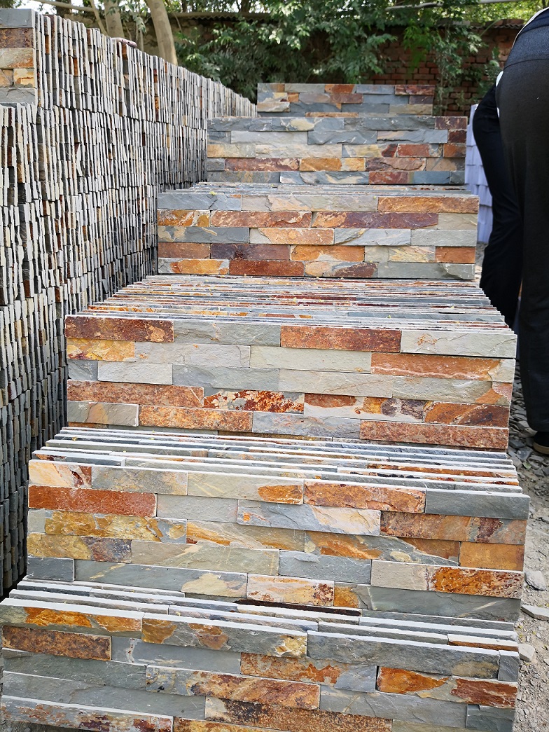
Variation is a hallmark of natuursteen, but large-scale architectural projects require visual cohesion. We solve the risk of “patchwork” walls by controlling the supply chain from the mountain to the crate. By sourcing material from the exact same quarry vein for each order, we ensure the natural shifts in color remain within a controlled, professional range.
- Batch Consistency: We source material from the same quarry layer per order to minimize drastic color shifts across the installation.
- 95% Hue Uniformity: Our internal quality standards maintain a high level of color synchronization within a single batch for seamless architectural results.
- CNC Diamond-Blade Precision: We use CNC cutting to ensure precision lines. This allows varied textures to fit tightly in our Z-shape or S-shape interlocking systems, camouflaging joints.
- Visual Verification: We provide high-definition photos and videos of the actual finished batch before shipment so you can confirm the color match before dispatch.

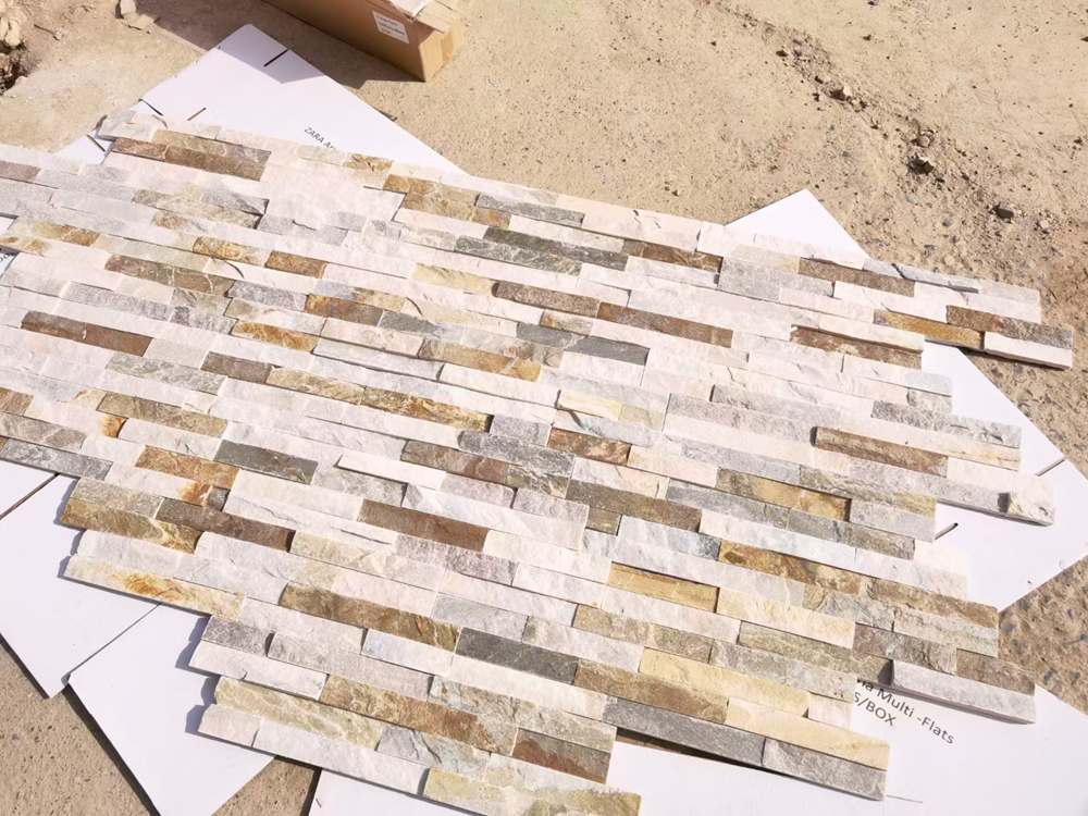
Modern Minimalism: The Global Rise of White Marble and Cool Gray Slate
Neutral stone tones maximize light reflectivity and spatial depth while same-batch quarry sourcing prevents color shifts that compromise large-scale minimalist designs.
Enhancing Spatial Perception Through Reflective and Neutral Tones
Minimalist architecture relies on the interplay of light and volume. High-reflectivity stones serve as a tool for designers to manipulate these elements without adding visual clutter. By using specific mineral compositions, we help architects expand perceived interior space in both residential and high-traffic commercial environments.
- Glacier White & Thassos: These materials amplify natural light, making compact interiors appear significantly larger and more open.
- Alaska Gray & Nordic Gray: Cool-toned slates provide a neutral backdrop that bridges the gap between raw concrete and warm wood accents.
- Carrara Marble: Fine, organic veining adds subtle texture that supports a clean aesthetic rather than distracting from it.
- Honed Finishes: Matte surfaces allow designers to manage glare across expansive kitchen islands and corporate lobbies.

Achieving Architectural Uniformity with the Flat Series and Quarry Consistency
Large-scale minimalist projects fail when the stone displays patchy color shifts or irregular joints. We solve this by controlling the supply chain from the mountain to the crate. Consistency is no longer a variable; it is a manufacturing standard achieved through precision engineering.
- Same-Batch Quarry Consistency: We source stone from the same quarry vein per order to ensure 95% hue uniformity across the entire installation.
- CNC Diamond-Blade Precision: Our Flat Series panels feature sharp, linear profiles that meet the demand for clean architectural edges.
- Z-Shape Interlocking Technology: This male-female connection system hides vertical joints and the substrate, creating a continuous stone surface that mimics expensive slab work.
- Big 10 Inventory Access: Keeping Alaska Gray and Glacier White in constant stock ensures B2B projects maintain a cohesive palette from the mock-up phase to the final delivery.
Premium Stacked Stone for Profitable Projects
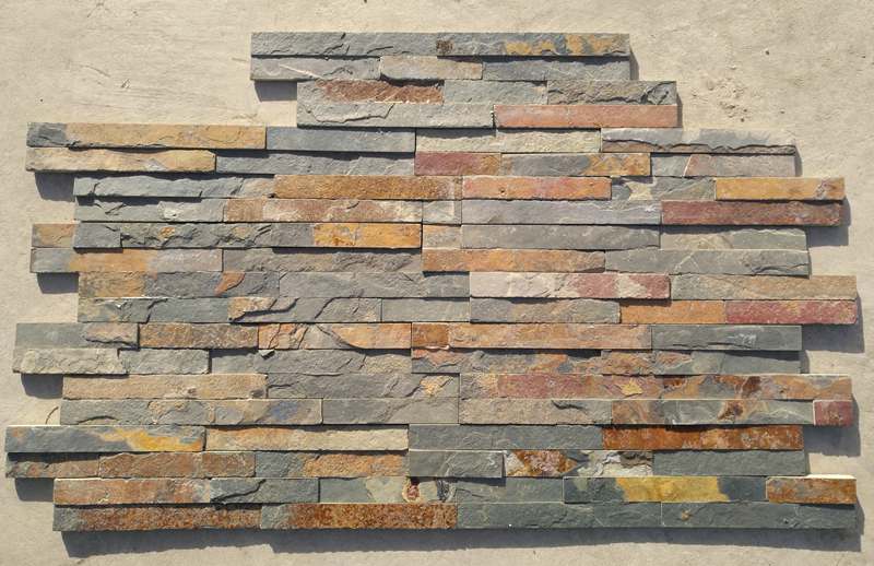
Creating Timeless Rustic Warmth with Earth Tones and Multi-color Blends
Layer natural pigments and source from single quarry veins to achieve visual harmony. Direct sourcing prevents patchy walls in large-scale multi-color stone installations.
The Role of Natural Earth Pigments in Rustic Design
Rustic design relies on the emotional impact of the earth. We integrate oxidized minerals, desert clay tones, and moss-inspired greens to ground interior environments. These tones act as a visual anchor, pulling the natural energy of the outdoors into a structured architectural space.
- Primary Palette: Burnt sienna, ochre, sandstone, and warm taupe pigments derived from natural mineral deposits.
- Biophilic Strategy: Tactile, natural cleft stone surfaces promote presence and wellbeing by mirroring organic environments.
- Texture Layering: Combine split-face stone with reclaimed wood and woven materials like jute to create visual depth.
- Architectural Softening: Muted cocoa and taupe pigments effectively reduce the clinical feel of hyper-modern or minimalist layouts.
Achieving Color Harmony with Same-Batch Quarry Consistency
Multi-color variation is the hallmark of natuursteen, but it becomes a liability if the transition between panels is too jarring. We solve this by controlling the supply chain from the mountain to the reinforced crate, ensuring the variation remains sophisticated rather than chaotic.
- Vein Control: We source material from the same quarry vein to guarantee 95% hue uniformity within a single project batch.
- Featured Models: California Gold (Slate) and Copper Canyon (Slate) provide a balanced mix of gold, rust, and earthen tones.
- Visual Verification: We provide high-definition pre-shipment photos of the finished crates to confirm the color balance before the balance payment.
- Installation Integrity: Precision cutting and batch management eliminate the “patchy” appearance common in lower-grade materials where different quarry layers are mixed.
Proper coordination requires looking at the secondary tones within the stone. By identifying the subtle flecks of copper or gray, designers can pull those colors into hardware or textiles to create a cohesive interior that feels intentionally curated rather than randomly assembled.
Design Coordination: Matching Stone with Existing Paint and Flooring
Successful design relies on coordinating undertones rather than seeking exact matches. Professionals identify the warm or cool base of a space and select stone with matching secondary colors.
| Coordination Factor | B2B Design Strategy | Technical Standard |
|---|---|---|
| Color Stability | Coordinate warm/cool undertones | 95% Hue Uniformity |
| Joint Management | Eliminate visible substrate gaps | CNC Diamond-Blade Precision |
| Transition Logic | Maintain texture across corners | Matching L-Corner Units |
Balancing Color Bases and Secondary Undertones
Matching natuursteen to an existing interior requires a focus on harmony over replication. We recommend identifying the primary color base of the room—warm, cool, or neutral—before selecting a stone profile. If you attempt to match stone and wood floors exactly, you often end up with a flat, monochromatic look that lacks depth.
Instead, look for secondary colors within the stone to bridge the design. For example, gray veining in white quartzite can be echoed in paint and hardware to create visual cohesion. For floor-to-wall transitions, use rugs or transition boards to separate distinct textures while allowing the colors to complement each other.
- Primary Base: Identify if the space uses creams and beiges (warm) or grays and charcoals (cool).
- Secondary Echo: Match copper flecks in slate or gold veining in marble with room hardware.
- Visual Contrast: Use slightly lighter or darker neutrals than the hardwood flooring to avoid a “washed out” appearance.
- Contextual Testing: Always check stone samples against cabinetry under actual 2026 site lighting.
Achieving Seamless Integration with Same-Batch Quarry Consistency
Technical consistency at the manufacturing level supports high-end design goals. Topbron steen uses same-batch quarry sourcing, pulling from the same mineral vein per order. This process ensures a 95% hue uniformity across large projects, preventing the “patchy” appearance common with mixed-source suppliers.
Our CNC diamond-blade precision edges on Z-shape and S-shape panels allow for a tight, interlocking fit. This eliminates visible vertical joints and prevents the substrate from showing through. When wrapping around columns or wall ends, matching L-corners maintain the color and texture synchronization required for a professional architectural finish.
- The Big 10 Inventory: Use standardized profiles like Alaska Gray or Glacier White to simplify paint matching.
- Seamless Technology: Interlocking male-female connections camouflage vertical seams.
- 90-Degree L-Corners: Pre-fabricated corners ensure color consistency at wall transitions.
- Color Protection: Apply pH-neutral stone sealants to prevent color shifts caused by moisture or cleaning agents.
Is Your Stone UV Stable? Will the Color Fade After Years of Exposure?
Real stone is chemically stable. Unlike artificial alternatives using organic dyes, natural quartzite and slate consist of inorganic minerals that never fade under sun exposure.
The Impact of UV Radiation on Architectural Surfaces
Ultraviolet radiation aggressively attacks the chemical bonds of unstable pigment ions. In the building industry, this process is the primary cause of color failure in manufactured materials. Most man-made “cultured” stones rely on cement-based dyes and organic components to achieve their look. These binders break down when exposed to consistent sunlight, leading to irreversible sun-bleaching.
This degradation creates a patchy, low-quality aesthetic over time. Because sunlight hits walls at different angles, exposed areas turn lighter or whiter while protected sections under eaves or behind landscaping retain their original shade. This lack of stability is a permanent structural change in the artificial pigment, meaning the color cannot be restored once the UV damage occurs.

Mineral Stability of 100% Natural Quartzite and Slate
Natural stone bypasses the fading issue because the color is not a surface treatment. At Top Source Stone, we source 100% natural minerals—specifically Quartzite, Slate, and Granite—where the hue is a permanent part of the stone’s geological DNA. These inorganic minerals remain chemically inert even under the most intense solar radiation.
- Material Integrity: 100% natural mineral composition with no artificial dyes or cement binders.
- Environmental Resistance: High-salinity and high-UV resistance, tested for performance in extreme climates like Australia and the Middle East.
- Color Consistency: We source from the same quarry vein per order, maintaining 95% hue uniformity across our Big 10 Inventory.
- Structural Longevity: Natural stone maintains its original texture and vibrancy for decades, far outlasting faux imitations.
By choosing direct quarry-sourced stone, you ensure that the project looks as vibrant in twenty years as it does on the day of installation. Real stone provides a level of color permanence that engineered products simply cannot match, especially in high-exposure exterior applications.
Veelgestelde vragen
What are the most popular stacked stone colors for 2026 architectural projects?
White and black are the primary choices for modern 2026 designs. Glacier White quartzite offers a clean aesthetic for bright spaces, while Carbon Black slate provides a bold, textured look for high-impact feature walls and fireplaces. We source these from the same quarry vein to ensure 95% hue uniformity within each batch.
Does natural stone fade when exposed to intense UV sunlight?
Natural stone is more UV stable than manufactured alternatives. While extreme exposure can cause subtle lightening in certain minerals over decades, our materials are selected for their density and resistance to fading. This ensures the color stays vibrant in both interior and exterior applications.
Which stone colors best complement gray exterior siding?
Alaska Gray or Golden White provide the best visual contrast against gray siding. To create a monochromatic look, designers often choose Sierra Blue or similar stones with blue-gray undertones. This ensures the natural texture stands out from the smooth siding panels.
How should I coordinate stacked stone with kitchen or bathroom cabinetry?
Matching undertones is the most effective strategy. Pair warm wood cabinets with stones like California Gold or Golden Honey. For white or cool-toned cabinets, use Alaska Gray or Glacier White quartzite panels to maintain a consistent color temperature across the space.
What is the ideal stone color for a fireplace surround?
Gray tones offer a sophisticated, contemporary feel, while warm creams like Golden Honey create a traditional, inviting atmosphere. For a dramatic or moody aesthetic, dark stones like Carbon Black or Midnight Slate are highly effective at making the fireplace the focal point.
Do these stone panels require a brick ledge or structural footing for installation?
No. Our stacked stone panels are engineered to be lightweight, averaging 8 to 12 lbs per square foot. They do not require a brick ledge or additional structural footings and can be installed directly onto most sound substrates, including cement board and masonry surfaces.
SEO
Title: How to Choose the Perfect Color for Your Natural Stacked Stone Project
Description: Stacked Stone Color Guide. 95% hue uniformity per batch. Direct quarry source factory for wholesalers. No retail. MOQ 300 sqm.
URL: stacked-stone-color-guide
Keywords: stacked stone color guide
